Kindred Marketing

Project

Kindred Marketing

The fractional seat I fill for a marketing agency. Account manager one month, social media manager the next, designer or developer when a build needs hands, brand strategist when a client doesn’t know what they’re trying to say yet.

Client

Kindred Marketing

Type

Marketing agency, white-label retainer

Scope

Account management, social, design & brand strategy

Engagement

Ongoing, across a number of their clients

Project Overview

Kindred is a marketing agency, and I’m the person they bring in when a seat needs filling. Some months that means account management, owning client communication and keeping timelines honest so nothing falls through the gap between the agency and the client. Other months it means running social media for a handful of their clients, stepping into a design or development job when a build needs another set of hands, or working on brand strategy when a client doesn’t yet know what they’re trying to say.

That is the whole idea behind the fractional role. A growing agency doesn’t need a full-time account manager, a full-time social manager and a full-time designer all sitting idle between projects. It needs someone who can move between those seats depending on which one is empty this quarter.

Working inside an agency also keeps me current in a way client work alone doesn’t. I see how agencies actually scope, price, staff and deliver, and that context comes back with me to every small business I work with directly.

Account Management

Social Media Management

Design & Development

Brand Strategy

Why It Works

The seat you feel before you can justify filling it

A full-time ops manager, account manager or project manager is a six-figure commitment before payroll taxes and benefits. Most growing agencies feel that gap long before the numbers justify the hire, so the work gets absorbed by whoever has the least full plate that week. Usually the founder.

Five to ten hours a week of someone who already knows the work closes it. No ramp-up, no job posting, no salary you have to grow into.

Got a seat you need filled?

Tell me which part of the work keeps slipping and I’ll tell you honestly whether a few hours a week fixes it.
Farmwife Financials

Project

Farmwife Financials

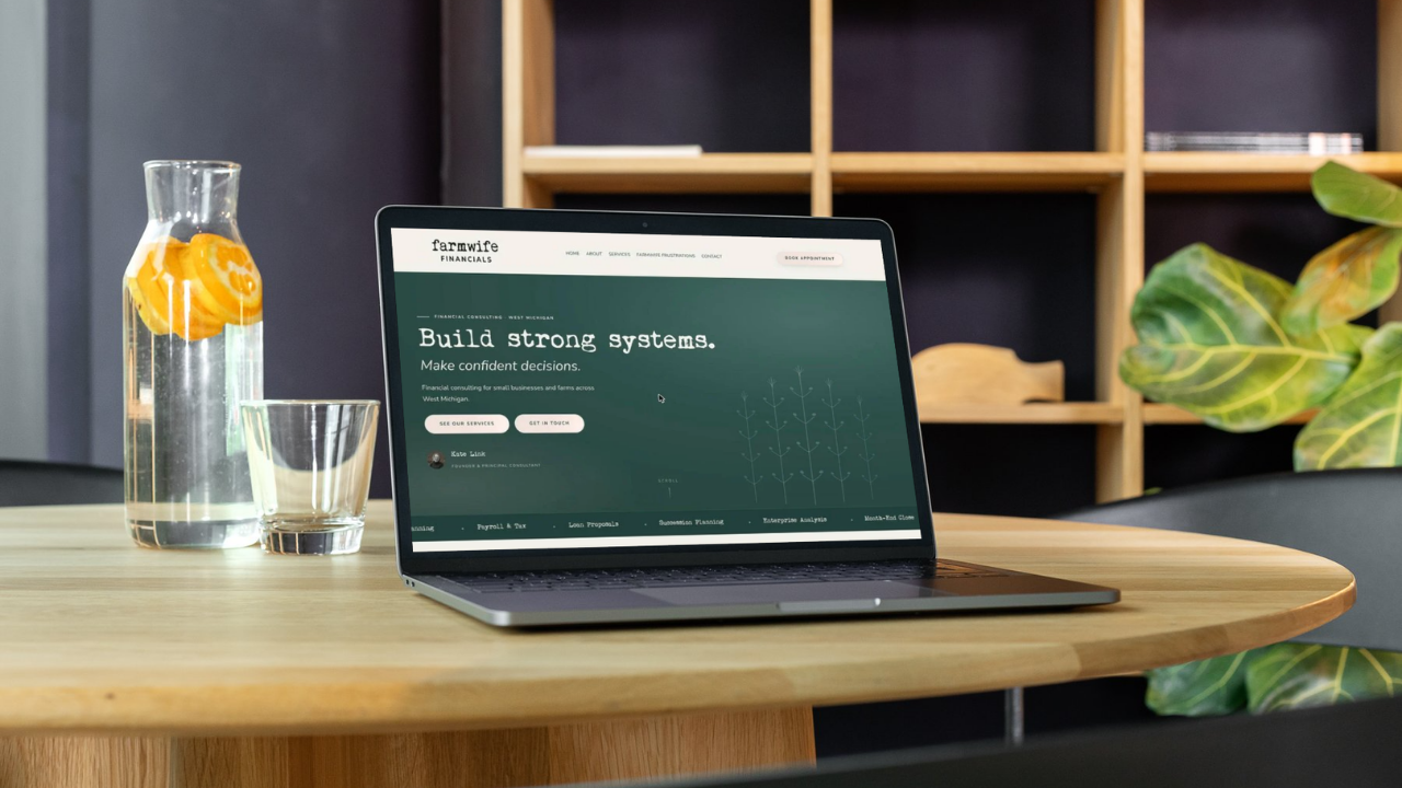
Brand identity and a full website build for a West Michigan bookkeeping and financial systems practice, currently finishing up before launch.

Farmwife Financials website shown on a laptop

Client

Farmwife Financials, LLC

Main Contact

Kate Link

Scope

Brand identity & full website build

Status

Coming soon — farmwifefinancials.com

Project Overview

Kate Link of Farmwife Financials helps organizations build strong bookkeeping systems, clean up messy accounting, and plan for what’s next. Practical, no-frills financial support for small businesses going through growth or transition.

This project paired a full brand identity with a new website: a wordmark and colour system built to feel earthy, grounded and calm, and a site structured around how Kate actually works with clients. Services, process, and a clear path to booking a conversation.

The site is in its final stretch before launch. This page gets updated with the live screenshots once it is public.

Brand Identity

Logo Design

Website Design

Website Build

Branding

An earthy, grounded colour system

The Farmwife Financials brand pairs a friendly typewriter wordmark with a warm, muted palette. Practical and calm, the same way Kate approaches the numbers.

Cascades#2D4F4A

Palladian Blue#8DAEAD

Nuance#E8E4DA

Off-White#F4F1EB

Brand Guide

The whole system, page by page

Click through the pages below to explore the full brand guide.

Want something like this?

Let’s build something that actually represents your business and works as hard as you do.

Be Happy Flowers

Project

Be Happy Flowers

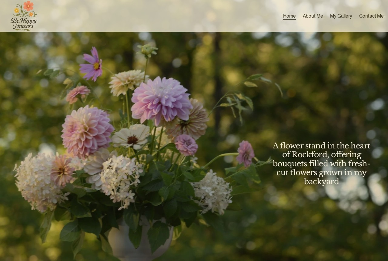
Brand identity, custom logo, and a fresh website for a backyard-grown wildflower business in Rockford, Michigan.

behappyflowers.com

Be Happy Flowers website homepage

Client

Be Happy Flowers

Location

Rockford, Michigan

Scope

Brand identity, logo, website design & build

Project Overview

Be Happy Flowers is a small, heart-led wildflower business built from a backyard garden in Rockford, Michigan. A friend of mine grows the most wholesome mix of seasonal wildflowers and turns them into gorgeous, joy-filled bouquets for her local community.

For this project I created a new brand identity and custom logo that feel as warm and organic as the flowers themselves, then designed and built a fresh website to showcase her story, seasonal offerings, and ordering details in a simple, welcoming way.

The site focuses on slow, backyard-grown beauty rather than a traditional florist catalog, prioritizing photos of real bouquets, easy ways to get in touch, and clear information about bouquet pickups and local availability.

Together, the new branding and website give Be Happy Flowers a more intentional online presence while still feeling personal, approachable, and true to her backyard-grown roots.

Brand Identity

Logo Design

Website Design

Website Build

Branding

Logo Design

The Be Happy Flowers logo was designed to feel as warm and joyful as a backyard bouquet. Soft, organic, and approachable. It captures the heart of a small, homegrown wildflower business while still feeling polished enough to live on the website, social media, and printed pieces.

The logo pairs friendly typography with a simple floral motif so it is easy to recognize at a glance and flexible enough to work across everything from bouquet tags to digital graphics.

Want something like this?

Let’s build something that actually represents your business and works as hard as you do.

Jennifer Ann’s Boutique & Artisan Shop

Project

Jennifer Ann’s Boutique & Artisan Shop

Brand identity, logo, and a website for a charming small-town boutique and artisan shop.

jenniferannsboutique.com

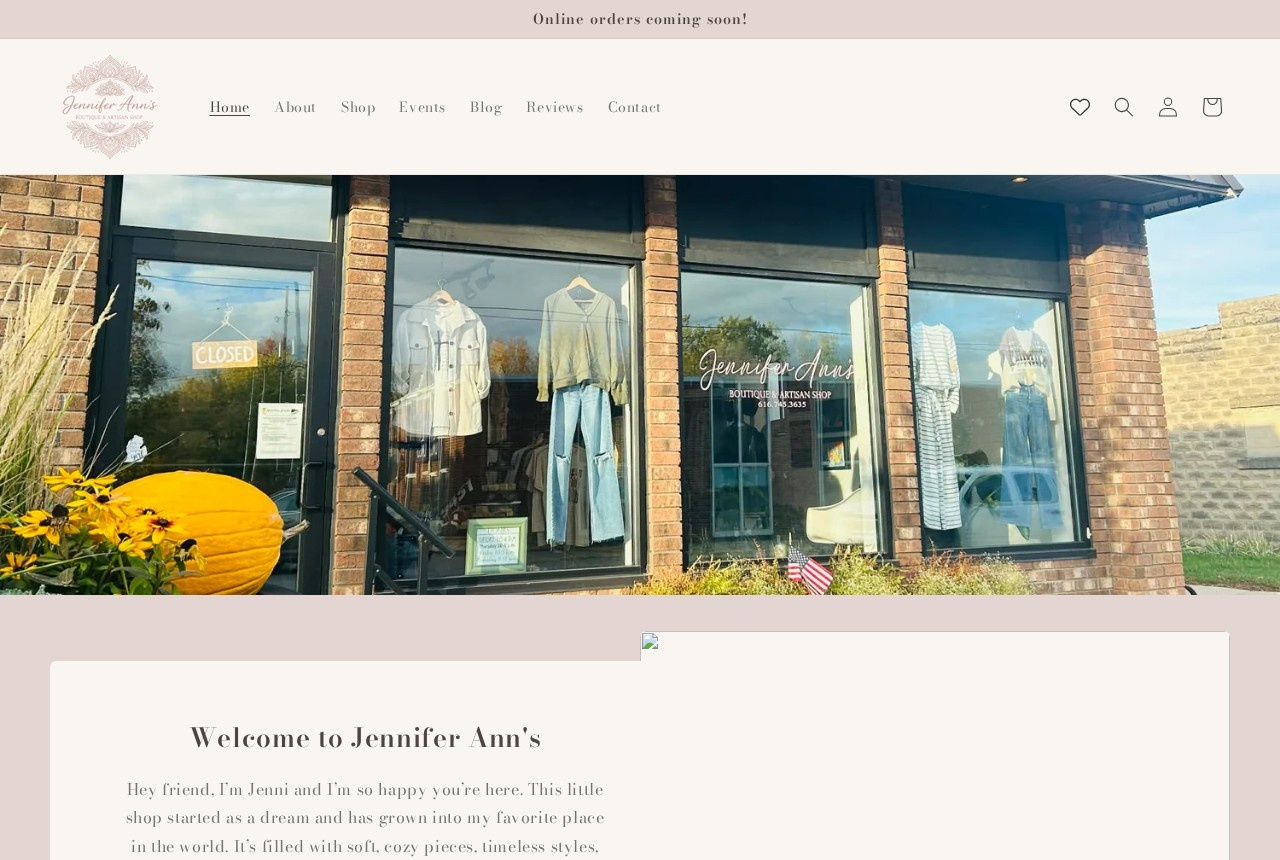
Jennifer Ann's Boutique and Artisan Shop website homepage

Client

Jennifer Ann’s Boutique & Artisan Shop

Main Contact

Jennifer Broton

Scope

Brand identity, logo & website build

Project Overview

Jennifer Ann’s Boutique & Artisan Shop is a charming small-town boutique offering soft, cozy pieces, timeless styles, and one-of-a-kind artisan goods.

This project focused on creating a polished, welcoming web presence that reflects the warmth of the brand while making it easy for visitors to explore the shop and connect with the business.

The goal of the brand and website presentation was to highlight the boutique’s personality, support local makers, and create a visual identity that feels approachable, elevated, and community-centered.

Brand Identity

Logo Design

Website Design

Website Build

Branding

Logo Design

The branding for Jennifer Ann’s Boutique & Artisan Shop was created to capture the shop’s soft, cozy style and its connection to handmade artisan goods. The logo supports that vision with a look that feels feminine, classic, and approachable while giving the business a polished visual identity across print and digital touchpoints.

Part Two

Bringing the online store to life

Phase one got Jennifer Ann’s Boutique & Artisan Shop a brand identity, a logo, and a welcoming website. Phase two is about turning that into a real online store, not just a pretty homepage.

With her in-store inventory now organized in Square and every item assigned a proper SKU and barcode, the pieces are finally in place to bring the online shop fully up to speed: item pages built out, inventory synced between the register and the website, and barcode labels printed and in use so in-store and online stay in sync automatically.

It’s the difference between a boutique with a website and a boutique that can actually sell online without double-entering a single item by hand.

Want something like this?

Let’s build something that actually represents your business and works as hard as you do.

The Derm Institute of West Michigan

Project

The Derm Institute of West Michigan

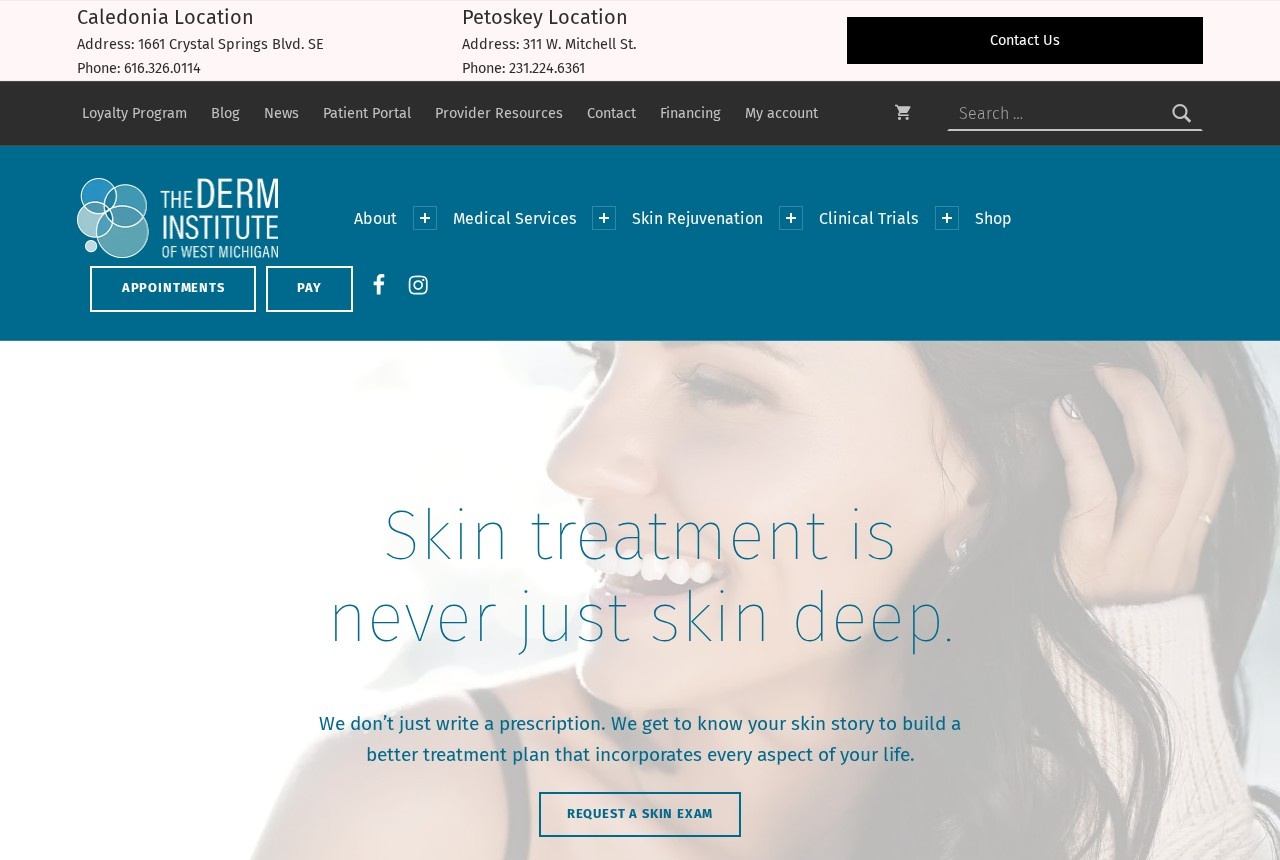
A brand guide, a website refresh, social media, and event support for a West Michigan dermatology and skincare practice.

derminstituteofwmi.com

The Derm Institute of West Michigan website homepage

Client

The Derm Institute of West Michigan

Scope

Brand guide, website, social & events

Project Overview

While at Oh Hello Branding Group, I worked with The Derm Institute of West Michigan to build a brand guide around the look and feel their skincare line had already established. The goal was consistency across the whole practice without throwing out the identity they had spent years building.

Once the guide was in place, I refreshed the website and reworked their existing marketing materials to match. I also ran their social media accounts, designing campaigns and graphics that carried the updated look into every post.

Beyond the design and digital work, I supported planning and promotion for several of their fundraising events, and wrote a handful of blog posts highlighting Dr. Kristi Hawley’s skincare expertise.

The result was a brand that finally held together, online and in the room.

Brand Guide

Website Refresh

Social Media

Events & Content

Branding

The logo and brand guide

The updated logo ties the skincare line back to the practice itself. Clean and clinical enough to belong in a medical office, warm enough that it does not feel cold on a shelf.

The full guide documents the colour palette, the typography, the logo usage rules, and the visual tone, so the team can keep every piece of collateral consistent without guessing.

Click through the pages below to explore the whole thing.

Want something like this?

Let’s build something that actually represents your business and works as hard as you do.